
Rethinking data visualization
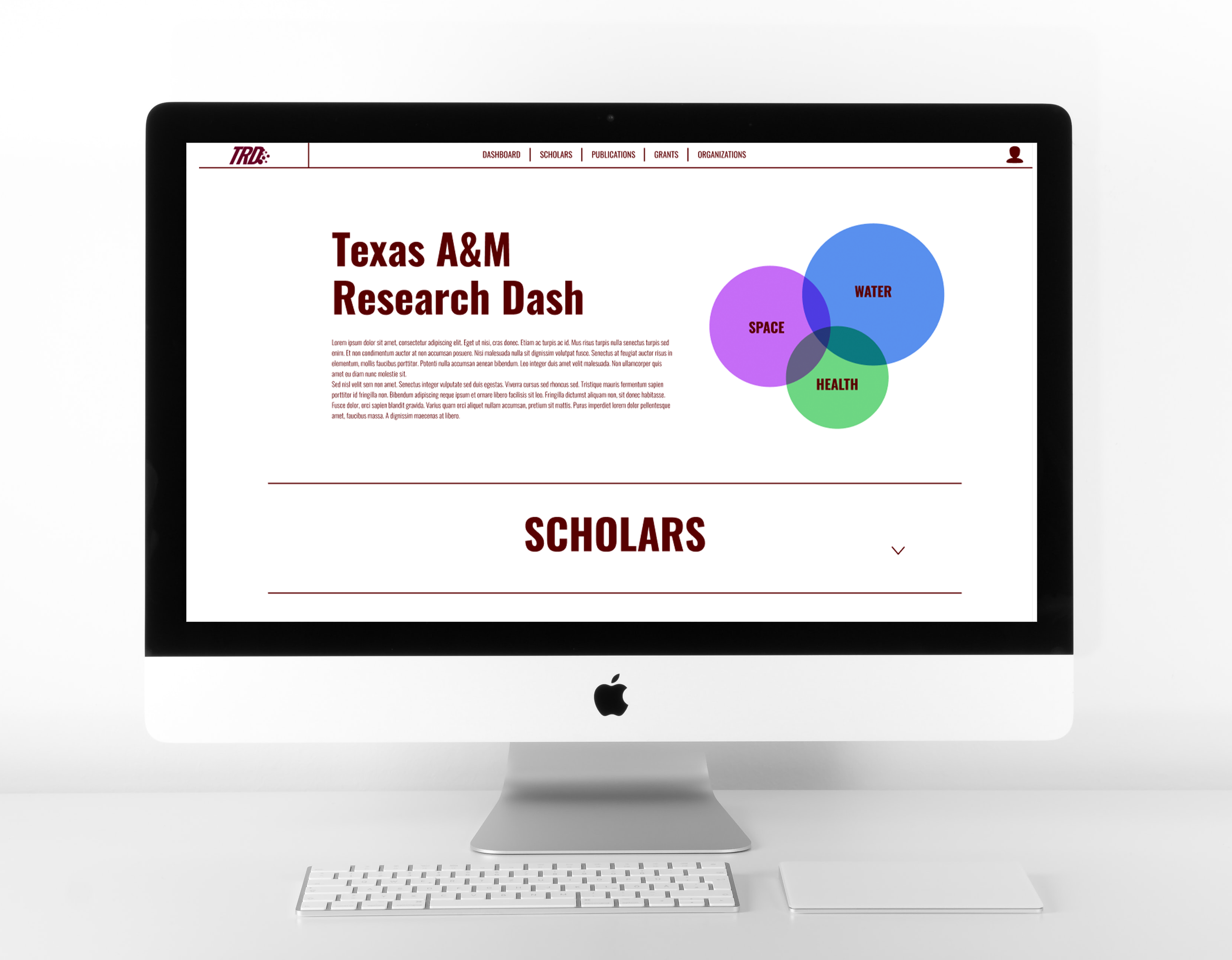
The Texas A&M Research Dashboard is a web page being used to visualize and share data among scholars. The current site is filled with broken graphs and a confusing interface. In an interactive media studio class, teams were challenged with coming up with new design solutions to better visualize their data.
-
My Role
Project manager / Home page / Scholars page / Prototyping
-
Tools
Figma / Adobe Illustrator / Google Drive
-
duration
5 Weeks (November 2021 - December 2021)
walkthrough
My portion of this prototype includes the home page and the “scholars” page. I created a home page with a brief description about the web page’s general purpose at the top and collapsible sections to provide descriptions of each individual page so the user can get an idea of what each page is about before navigating to it. For users who already know what page they are looking for, there is easy access to each page in the top navigation bar. I also developed a new logo for the top left corner of the site.
For the scholars page, I chose to create a circle map that showcases each scholar’s name, number of publications, field of study, and who they have collaborated with. The size of the scholar’s circle is dictated by their number of publications, the color represents their field of study, and the collaborations are shown by overlapping circles. More information on each scholar is provided when their circle is clicked.